File:Screen shot 2013-04-11 at 9.58.53 am.png
Jump to navigation
Jump to search

Size of this preview: 799 × 600 pixels. Other resolutions: 320 × 240 pixels | 906 × 680 pixels.
Original file (906 × 680 pixels, file size: 37 KB, MIME type: image/png)
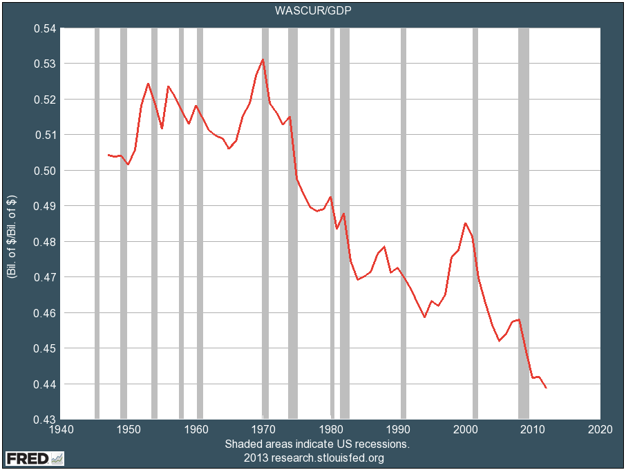
- What: total wages as a portion of GDP
- Source: http://www.businessinsider.com/profits-at-high-wages-at-low-2013-4
Notes
- The descent isn't quite as precipitous as this chart makes it look -- the scale only shows 0.43 to 0.54. These few percentage points, however, are sufficient to drive some very large changes.
- It seems likely that the peaks near each recession are due not to rising wages but falling GDP. It might be interesting to see this graph redone using a ten-year moving average GDP, to smooth out the recessions and see more of what's happening to wages in the short term.
File history
Click on a date/time to view the file as it appeared at that time.
| Date/Time | Thumbnail | Dimensions | User | Comment | |
|---|---|---|---|---|---|
| current | 01:34, 2 June 2013 | | 906 × 680 (37 KB) | Woozle (talk | contribs) | '''Source''': http://www.businessinsider.com/profits-at-high-wages-at-low-2013-4 |
You cannot overwrite this file.
File usage
The following page uses this file: